Custom Themes
This feature is enabled for all new sitekeys on Pro and Enterprise accounts. If your sitekey does not accept custom themes, please contact support for assistance.
This document describes the custom theming feature, how to enable it, and the accepted schema that controls theme options.
Built-in Themes vs. Custom Themes
hCaptcha offers several pre-defined color schemes ("themes"), which you can choose by simply setting the theme property to one of those strings.
Custom Themes instead let you customize any color in the hCaptcha UI to match your brand requirements by passing a JS object at render time, as described below.
How to enable Custom Themes
First, the query parameter custom=true must be added to the https://js.hcaptcha.com/1/api.js script tag to let the hCaptcha client know it should load themes. Note that this will be ignored if the feature has not been enabled for your account. When using custom themes, the current theme configuration method takes a JSON string or Javascript object matching the theme schema outlined below.
Example Setup
  <script src="https://js.hcaptcha.com/1/api.js?render=explicit&onload=onLoad&custom=true" async defer></script>

  <script type="text/javascript">

    var onLoad = function() {
      hcaptcha.render("h-captcha", {
        "sitekey": "<sitekey>",
        "theme"  : {
          palette: {
            primary: {
              main: "#00FF00"
            },
            text: {
              heading: "#454545",
              body   : "#8C8C8C"
            }
          }
        }
      });
    };

  </script>
Custom Theme Configurator
The Custom Theme Configurator serves as an example of how to build your own Custom Themes and is a resource for building your own schema, but it does not represent all the customizable values between the palette and component properties.
Color Configuration
Palette Customization
Our overall style guide and color system used to style internal components.Grey:
Primary:
Warn:
Text:
Component Customization
Style individual UI elements beyond the general palette.Checkbox:
Main
Hover
Modal:
Main
Hover
Focus
Challenge:
Main
Hover
Breadcrumb:
Main
Active
Button:
Main
Hover
Focus
Active
Link:
Focus
List:
Main
ListItem:
Main
Hover
Selected
Focus
Input:
Main
Focus
Radio:
Main
Selected
Focus
Task:
Main
Selected
Report
Focus
Prompt:
Main
Report
SkipButton:
Main
Hover
Focus
VerifyButton:
Main
Hover
Focus
Slider:
Main
Focus
Textarea:
Main
Focus
Disabled


Configurator Schema Output
var theme = {
  "palette": {
    "mode": "light",
    "grey": {
      "100": "#FAFAFA",
      "200": "#F5F5F5",
      "300": "#E0E0E0",
      "400": "#D7D7D7",
      "500": "#BFBFBF",
      "600": "#919191",
      "700": "#555555",
      "800": "#333333",
      "900": "#222222",
      "1000": "#14191F"
    },
    "primary": {
      "main": "#00838F"
    },
    "warn": {
      "main": "#EB5757"
    },
    "text": {
      "heading": "#555555",
      "body": "#555555"
    }
  },
  "component": {
    "checkbox": {
      "main": {
        "fill": "#FAFAFA",
        "border": "#E0E0E0"
      },
      "hover": {
        "fill": "#F5F5F5"
      }
    },
    "modal": {
      "main": {
        "fill": "#FFFFFF"
      },
      "hover": {
        "fill": "#F5F5F5"
      },
      "focus": {
        "outline": "#0074BF"
      }
    },
    "challenge": {
      "main": {
        "fill": "#FAFAFA",
        "border": "#E0E0E0"
      },
      "hover": {
        "fill": "#FAFAFA"
      }
    },
    "breadcrumb": {
      "main": {
        "fill": "#F5F5F5"
      },
      "active": {
        "fill": "#00838F"
      }
    },
    "button": {
      "main": {
        "fill": "#FFFFFF",
        "icon": "#555555",
        "text": "#555555"
      },
      "hover": {
        "fill": "#F5F5F5"
      },
      "focus": {
        "icon": "#00838F",
        "text": "#00838F",
        "outline": "#0074BF"
      },
      "active": {
        "fill": "#F5F5F5",
        "icon": "#555555",
        "text": "#555555"
      }
    },
    "link": {
      "focus": {
        "outline": "#0074BF"
      }
    },
    "list": {
      "main": {
        "fill": "#FFFFFF",
        "border": "#D7D7D7"
      }
    },
    "listItem": {
      "main": {
        "fill": "#FFFFFF",
        "line": "#F5F5F5",
        "text": "#555555"
      },
      "hover": {
        "fill": "#F5F5F5"
      },
      "selected": {
        "fill": "#E0E0E0"
      },
      "focus": {
        "outline": "#0074BF"
      }
    },
    "input": {
      "main": {
        "fill": "#FAFAFA",
        "border": "#919191"
      },
      "focus": {
        "fill": "#F5F5F5",
        "border": "#333333",
        "outline": "#0074BF"
      }
    },
    "radio": {
      "main": {
        "fill": "#F5F5F5",
        "border": "#919191",
        "check": "#F5F5F5"
      },
      "selected": {
        "check": "#00838F"
      },
      "focus": {
        "outline": "#0074BF"
      }
    },
    "task": {
      "main": {
        "fill": "#F5F5F5"
      },
      "selected": {
        "badge": "#00838F",
        "outline": "#00838F"
      },
      "report": {
        "badge": "#EB5757",
        "outline": "#EB5757"
      },
      "focus": {
        "badge": "#00838F",
        "outline": "#00838F"
      }
    },
    "prompt": {
      "main": {
        "fill": "#00838F",
        "border": "#00838F",
        "text": "#FFFFFF"
      },
      "report": {
        "fill": "#EB5757",
        "border": "#EB5757",
        "text": "#FFFFFF"
      }
    },
    "skipButton": {
      "main": {
        "fill": "#919191",
        "border": "#919191",
        "text": "#FFFFFF"
      },
      "hover": {
        "fill": "#555555",
        "border": "#919191",
        "text": "#FFFFFF"
      },
      "focus": {
        "outline": "#0074BF"
      }
    },
    "verifyButton": {
      "main": {
        "fill": "#00838F",
        "border": "#00838F",
        "text": "#FFFFFF"
      },
      "hover": {
        "fill": "#00838F",
        "border": "#00838F",
        "text": "#FFFFFF"
      },
      "focus": {
        "outline": "#0074BF"
      }
    },
    "slider": {
      "main": {
        "bar": "#C4C4C4",
        "handle": "#0F8390"
      },
      "focus": {
        "handle": "#0F8390"
      }
    },
    "textarea": {
      "main": {
        "fill": "#C4C4C4",
        "border": "#919191"
      },
      "focus": {
        "fill": "#C4C4C4",
        "outline": "#0074BF"
      },
      "disabled": {
        "fill": "#919191"
      }
    }
  }
};
Schema
We've divided our theming into two pieces: palette and component. Palette is our overall style guide and color system to use when applying styles to our components internally. Component provide customization at a granular level, in the event you want to style parts of the UI beyond simply updating greys or our primary color.
Finally we have a mode attached to palette that generally dictates how we look up a color. For example if the mode is set to light then text will be a dark grey variant, specifically Grey 700. However when dark is set, the text would use Grey 100 as the base color. In short, the grey values looked up are flipped based on mode set.
Below is an outline of the entire schema that can be provided. A subset or even a single property change can be provided and the rest will be merged based on the default styles set by either mode.
var theme = {
  palette: {
    mode: "light",
    grey: {
      100 : "#FAFAFA",
      200 : "#F5F5F5",
      300 : "#E0E0E0",
      400 : "#D7D7D7",
      500 : "#BFBFBF",
      600 : "#919191",
      700 : "#555555",
      800 : "#333333",
      900 : "#222222",
      1000: "#14191F"
    },
    primary: {
      main: "#00838F"
    },
    warn: {
      main: "#EB5757"
    },
    text: {
      heading: "#555555",
      body   : "#555555"
    }
  },
  component: {
    checkbox: {
      main: {
        fill  : "#FAFAFA",
        border: "#E0E0E0"
      },
      hover: {
        fill: "#F5F5F5"
      }
    },
    challenge: {
      main: {
        fill  : "#FAFAFA",
        border: "#E0E0E0"
      },
      hover: {
        fill: "#FAFAFA"
      }
    },
    modal: {
      main: {
        fill  : "#FFFFFF"
      },
      hover: {
        fill: "#F5F5F5"
      },
      focus: {
        outline: "#0074BF"
      }
    },
    breadcrumb: {
      main: {
        fill: "#F5F5F5"
      },
      active: {
        fill: "#00838F"
      }
    },
    button: {
      main: {
        fill: "#FFFFFF",
        icon: "#555555",
        text: "#555555"
      },
      hover: {
        fill: "#F5F5F5"
      },
      focus: {
        icon   : "#00838F",
        text   : "#00838F",
        outline: "#0074BF"
      },
      active: {
        fill: "#F5F5F5",
        icon: "#555555",
        text: "#555555"
      }
    },
    link: {
      focus: {
        outline: "#0074BF"
      }
    },
    list: {
      main: {
        fill  : "#FFFFFF",
        border: "#D7D7D7"
      }
    },
    listItem: {
      main: {
        fill: "#FFFFFF",
        line: "#F5F5F5",
        text: "#555555"
      },
      hover: {
        fill: "#F5F5F5"
      },
      selected: {
        fill: "#E0E0E0"
      },
      focus: {
        outline: "#0074BF"
      }
    },
    input: {
      main: {
        fill  : "#FAFAFA",
        border: "#919191"
      },
      focus: {
        fill   : "#F5F5F5",
        border : "#333333",
        outline: "#0074BF"
      }
    },
    field: {
      label: "#222222",
      input: {
        main: {
          border: "#D7D7D7",
          fill: "#FFFFFF",
          text: "#14191F"
        },
        focus: {
          outline: "#00838F",
          fill: "#F5F5F5"
        },
        error: {
          border: "#BF1722",
          text: "#BF1722"
        }
      }
    },
    radio: {
      main: {
        file  : "#F5F5F5",
        border: "#919191",
        check : "#F5F5F5"
      },
      selected: {
        check: "#00838F"
      },
      focus: {
        outline: "#0074BF"
      }
    },
    task: {
      // Image shown in challenge to be answered
      main: {
        fill: "#F5F5F5"
      },
      selected: {
        badge: "#00838F",
        outline: "#00838F"
      },
      report: {
        badge: "#EB5757",
        outline: "#EB5757"
      },
      details: {
        heading: '#222222',
        text: '#222222',
      },
      focus: {
        badge: "#00838F",
        outline: "#00838F"
      }
    },
    prompt: {
      main: {
        fill  : "#00838F",
        border: "#00838F",
        text  : "#FFFFFF"
      },
      report: {
        fill  : "#EB5757",
        border: "#EB5757",
        text  : "#FFFFFF"
      }
    },
    skipButton: {
      main: {
        fill  : "#919191",
        border: "#919191",
        text  : "#FFFFFF"
      },
      hover: {
        fill  : "#555555",
        border: "#919191",
        text  : "#FFFFFF"
      },
      focus: {
        outline: "#0074BF"
      }
    },
    verifyButton: {
      main: {
        fill  : "#00838F",
        border: "#00838F",
        text  : "#FFFFFF"
      },
      hover: {
        fill  : "#00838F",
        border: "#00838F",
        text  : "#FFFFFF"
      },
      focus: {
        outline: "#0074BF"
      },
      disabled: {
        fill  : "#919191",
        border: "#919191",
        text  : "#FFFFFF"
      },
    },
    mfaButton: {
      main: {
        fill  : "#00838F",
        border: "#00838F",
        text  : "#FFFFFF"
      },
      hover: {
        fill  : "#00838F",
        border: "#00838F",
        text  : "#FFFFFF"
      },
      focus: {
        outline: "#0074BF"
      }
    },
    slider: {
      main: {
        bar   : "#C4C4C4",
        handle: "#0F8390"
      },
      focus: {
        handle: "#0F8390"
      }
    },
    textarea: {
      main: {
        fill  : "#C4C4C4",
        border: "#919191"
      },
      focus: {
        fill   : "#C4C4C4",
        outline: "#0074BF"
      },
      disabled: {
        fill: "#919191"
      }
    }
  }
};
Schema Visual Walkthrough
Palette
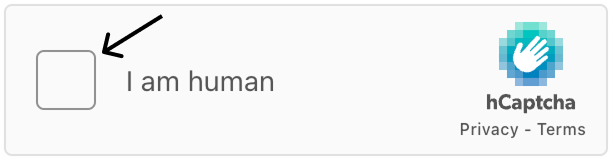
Palette.grey values are used if no component colors are used directly. If you create a new theme with purely the palette property, these values will be used throughout the checkbox widget and challenge.
Palette.primary is the color of the underline beneath the heading of the menu modal.
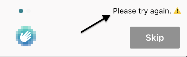
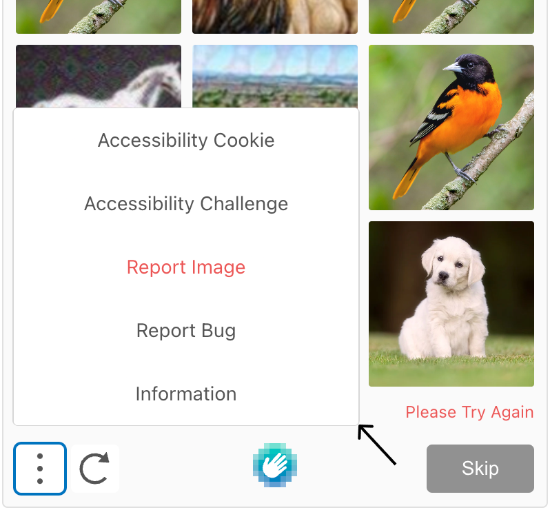
Palette.warn is the "Please Try Again" text if a challenge isn't passed.
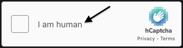
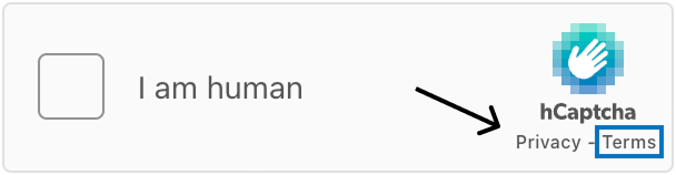
Palette.text includes .heading, the heading of the menu's modal pop-ups, and .body, the "I am human" text beside the widget's checkbox.
Component
The checkbox values style the checkbox widget.
-
.main.fillis the background color, and.main.borderis the border color of the hCaptcha widget. -
.hover.fillis the background color of the hCaptcha widget when hovering.
The modal values style the modal pop-ups when clicking a ListItem within the challenge's menu (vertical ellipsis).
-
.main.fillis the background color of the modal. -
.hover.fillis the modal's background color when hovering. -
.focus.outlineis the modal's outline color when focused.
The challenge values style the challenge pop-up users must solve to complete the hCaptcha.
-
.main.fillis the background color, and.main.borderis the border color of the challenge. -
.hover.fillis the background color of the challenge when hovering.
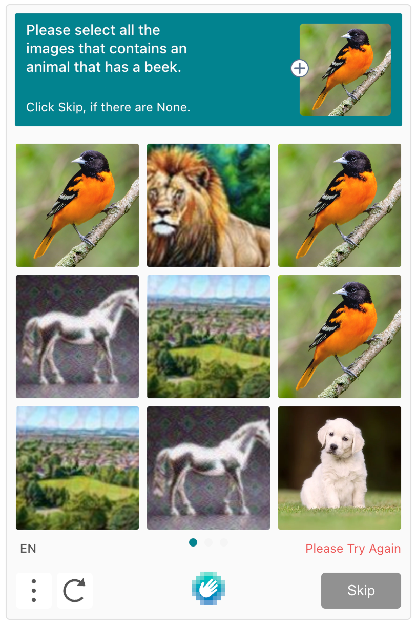
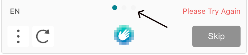
The breadcrumb values style the horizontal ellipsis beneath the challenge images.
-
.main.fillare the inactive dots shown. -
.main.activeis the active dot shown.
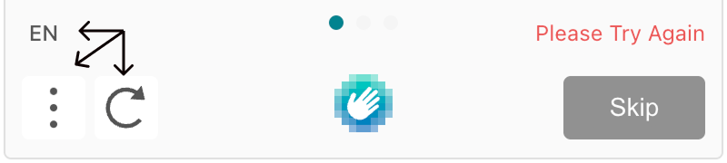
The button values style the interface icon buttons in the bottom-left of the challenge.
-
.main.fillis the button's background color,.main.iconis the icon's color, and.main.textis the color of the abbreviated language text. -
.hover.fillis the button's background color when hovering. -
.focus.iconis the color of the icon when hovering,.focus.textis not live, andfocus.outlineis the button's outline color when focused. -
.activeproperties are not live.
The link.focus.outline value is the outline color surrounding the "Privacy" and "Terms" links when focused.
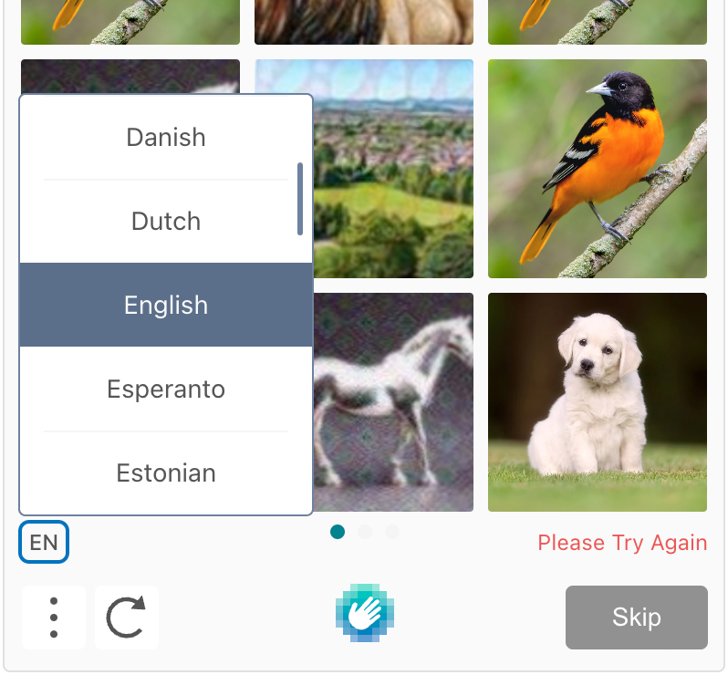
The list values style the modals with list items that open when clicking the icon buttons in the bottom-left of the challenge.
.main.fillis the background color (behind ListItem), and.main.borderis the modal's border color.
The listItem values style the clickable rows within the language list and menu modals.
-
.main.fillis the background color,main.lineis the horizontal line separating rows, andmain.textis the text color of a ListItem. -
.hover.fillis the background color of the ListItem when hovering. -
.selected.fillis the background color of the ListItem selected from the list. -
.focus.outlineis not live.
The input values style the clickable checkbox within the widget that renders the check upon completion of the hCaptcha.
-
.main.fillis the background color, andmain.borderis the border color of the square checkbox. -
focus.borderis the border color when hovering andfocus.outlineis the outline color when focused..focus.fillis not live.
The radio values style the checkboxes when reporting an issue within the menu modal.
-
.main.fillis the checkbox's background color andmain.borderis the border color.main.checkis not live. -
.selected.checkis the colored area within the checkbox indicating the selected item. -
.focus.outlineis the outline color of the checkbox when focused.
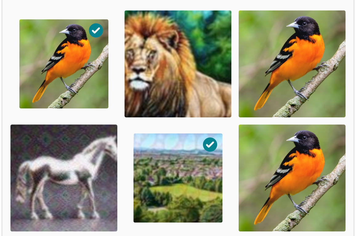
The task values style the images and badge used in the hCaptcha challenge.
-
.main.fillis the background color behind the challenge image. -
.selected.badgeis the color of the checkmark circle, and.selected.outlineis the color of the outline indicating a selected image within the challenge. -
.report.badgeis the color of the checkmark circle and.selected.outlineis the color of the outline when selecting an image to report within the challenge. -
.focus.badgeand.focus.outlineare not live.
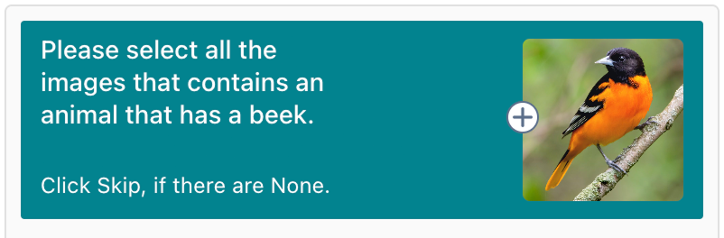
The prompt values style the header area that provides instructions for the challenge.
-
.main.fillis the background color,.main.borderis the border color, andmain.textis the text color of the header area of the challenge. -
.reportproperties are not live.
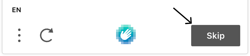
The skipButton values style the "Skip" button in the bottom-right of the challenge.
-
.main.fillis the background color,main.borderis the border color, andmain.textis the text color of the Skip button. -
.hover.fillis the background color,hover.borderis the border color, andhover.textis the text color of the Skip button when hovering. -
.focus.outlineis the outline color of the Skip button when focused.
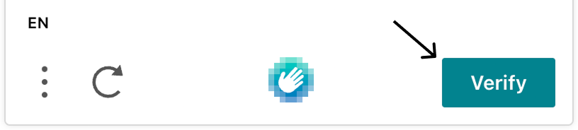
The verifyButton values style the "Verify" button in the bottom-right of the challenge.
-
.main.fillis the background color,main.borderis the border color, andmain.textis the text color of the Verify button. -
.hover.fillis the background color,hover.borderis the border color, andhover.textis the text color of the Verify button when hovering. -
.focus.outlineis the outline color of the Verify button when focused.
The slider values style the slider used in text free entry challenges.
-
.main.baris the slider's bar color and.main.handleis the controller color for the slider. -
.focus.handleis the slider's controller color when focused.
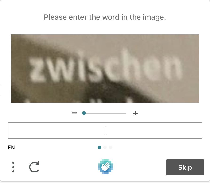
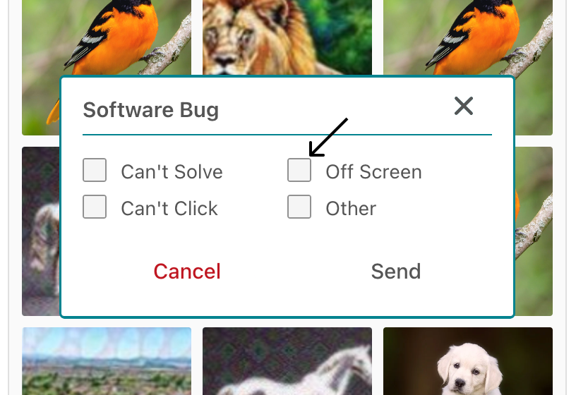
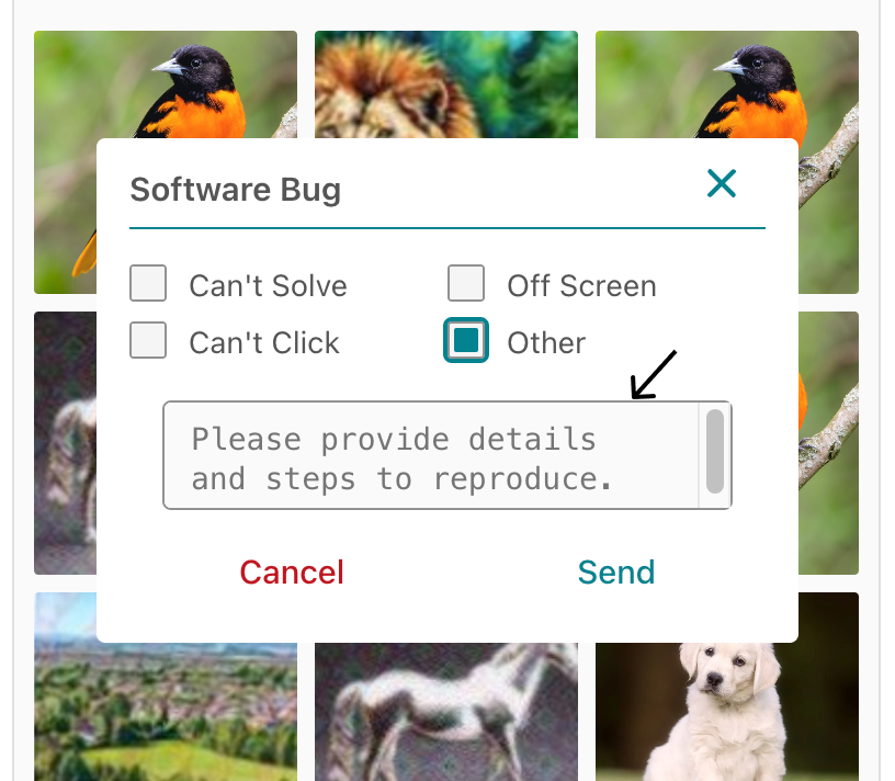
The textarea values style the text area when reporting a bug and the text area in the text free entry challenge.
.main.fillis the background color, and.main.borderis the border color of the "Other" text area when reporting a bug.
-
.focus.fillis the text area's background color and.focus.outlineis the outline color in the text free entry challenge when focused. -
.disabled.fillis the text area's background color in the text free entry challenge when disabled.
Try It Live
Test custom themes on a live hCaptcha widget:
Examples
Example using just palette customization:
var vibrantTheme = {
  palette: {
    mode: "light",
    grey: { 100: "#FAFAFA", 200: "#F5F5F5", 300: "#E0E0E0", 400: "#D7D7D7", 500: "#BFBFBF", 600: "#919191", 700: "#555555", 800: "#333333", 900: "#222222", 1000: "#14191F" },
    primary: { main: "#FF5722" },
    warn: { main: "#F44336" },
    text: { heading: "#212121", body: "#212121" }
  },
};
Example using both palette and component customization:
var subtleDarkTheme = {
  palette: {
    mode: "dark",
    grey: {
      100: "#FAFAFA",
      200: "#F5F5F5",
      300: "#E0E0E0",
      400: "#D7D7D7",
      500: "#BFBFBF",
      600: "#919191",
      700: "#787878",
      800: "#5E5E5E",
      900: "#444444",
      1000: "#2A2A2A"
    },
    primary: {
      main: "#607D8B"
    },
    warn: {
      main: "#FF5722"
    },
    text: {
      heading: "#F5F5F5",
      body: "#E0E0E0"
    }
  },
  component: {
    checkbox: {
      main: {
        fill: "#424242",
        border: "#616161"
      },
    },
    input: {
      main: {
        fill: "#424242",
        border: "#616161"
      },
      focus: {
        fill: "#555555",
        border: "#6A6A6A",
        outline: "#607D8B"
      }
    },
    challenge: {
      main: {
        fill: "#303030",
        border: "#424242"
      },
      hover: {
        fill: "#383838"
      }
    },
    button: {
      main: {
        fill: "#424242",
        icon: "#F5F5F5",
        text: "#F5F5F5"
      },
      hover: {
        fill: "#555555"
      },
      focus: {
        icon: "#607D8B",
        text: "#607D8B",
        outline: "#607D8B"
      },
      active: {
        fill: "#555555",
        icon: "#F5F5F5",
        text: "#F5F5F5"
      }
    },
    modal: {
      main: {
        fill: "#222222"
      },
      hover: {
        fill: "#303030"
      },
      focus: {
        outline: "#607D8B"
      }
    }
  }
};