Thèmes personnalisés
Cette fonctionnalité est activée pour toutes les nouvelles clés de site des comptes Pro et Entreprise. Si votre clé de site n'accepte pas les thèmes personnalisés, veuillez contacter l'assistance.
Ce document décrit la fonctionnalité de thème personnalisé, comment l'activer et le schéma accepté qui contrôle les options de thème.
Thèmes intégrés vs. thèmes personnalisés
hCaptcha propose plusieurs pre-defined color schemes ("themes"), que vous pouvez choisir en définissant simplement la propriété theme sur l'une de ces chaînes.
Les thèmes personnalisés vous permettent quant à eux de personnaliser n'importe quelle couleur de l'interface utilisateur hCaptcha pour correspondre aux exigences de votre marque en passant un objet JS au moment du rendu, comme décrit ci-dessous.
Comment activer les thèmes personnalisés
Tout d'abord, le paramètre de requête custom=true doit être ajouté à la balise de script https://js.hcaptcha.com/1/api.js pour indiquer au client hCaptcha qu'il doit charger les thèmes. Notez que ce paramètre sera ignoré si la fonctionnalité n'est pas activée pour votre compte. Lors de l'utilisation de thèmes personnalisés, la méthode de configuration actuelle theme accepte une chaîne JSON ou un objet JavaScript correspondant au schéma du thème décrit ci-dessous.
Exemple de configuration
  <script src="https://js.hcaptcha.com/1/api.js?render=explicit&onload=onLoad&custom=true" async defer></script>

  <script type="text/javascript">

    var onLoad = function() {
      hcaptcha.render("h-captcha", {
        "sitekey": "<sitekey>",
        "theme"  : {
          palette: {
            primary: {
              main: "#00FF00"
            },
            text: {
              heading: "#454545",
              body   : "#8C8C8C"
            }
          }
        }
      });
    };

  </script>
Configurateur de thème personnalisé
Le configurateur de thèmes personnalisés sert d'exemple pour créer vos propres thèmes personnalisés et constitue une ressource pour construire votre propre schéma, mais il ne représente pas toutes les valeurs personnalisables entre la palette et les propriétés des composants.
Color Configuration
Palette Customization
Our overall style guide and color system used to style internal components.Grey:
Primary:
Warn:
Text:
Component Customization
Style individual UI elements beyond the general palette.Checkbox:
Main
Hover
Modal:
Main
Hover
Focus
Challenge:
Main
Hover
Breadcrumb:
Main
Active
Button:
Main
Hover
Focus
Active
Link:
Focus
List:
Main
ListItem:
Main
Hover
Selected
Focus
Input:
Main
Focus
Radio:
Main
Selected
Focus
Task:
Main
Selected
Report
Focus
Prompt:
Main
Report
SkipButton:
Main
Hover
Focus
VerifyButton:
Main
Hover
Focus
Slider:
Main
Focus
Textarea:
Main
Focus
Disabled


Configurator Schema Output
var theme = {
  "palette": {
    "mode": "light",
    "grey": {
      "100": "#FAFAFA",
      "200": "#F5F5F5",
      "300": "#E0E0E0",
      "400": "#D7D7D7",
      "500": "#BFBFBF",
      "600": "#919191",
      "700": "#555555",
      "800": "#333333",
      "900": "#222222",
      "1000": "#14191F"
    },
    "primary": {
      "main": "#00838F"
    },
    "warn": {
      "main": "#EB5757"
    },
    "text": {
      "heading": "#555555",
      "body": "#555555"
    }
  },
  "component": {
    "checkbox": {
      "main": {
        "fill": "#FAFAFA",
        "border": "#E0E0E0"
      },
      "hover": {
        "fill": "#F5F5F5"
      }
    },
    "modal": {
      "main": {
        "fill": "#FFFFFF"
      },
      "hover": {
        "fill": "#F5F5F5"
      },
      "focus": {
        "outline": "#0074BF"
      }
    },
    "challenge": {
      "main": {
        "fill": "#FAFAFA",
        "border": "#E0E0E0"
      },
      "hover": {
        "fill": "#FAFAFA"
      }
    },
    "breadcrumb": {
      "main": {
        "fill": "#F5F5F5"
      },
      "active": {
        "fill": "#00838F"
      }
    },
    "button": {
      "main": {
        "fill": "#FFFFFF",
        "icon": "#555555",
        "text": "#555555"
      },
      "hover": {
        "fill": "#F5F5F5"
      },
      "focus": {
        "icon": "#00838F",
        "text": "#00838F",
        "outline": "#0074BF"
      },
      "active": {
        "fill": "#F5F5F5",
        "icon": "#555555",
        "text": "#555555"
      }
    },
    "link": {
      "focus": {
        "outline": "#0074BF"
      }
    },
    "list": {
      "main": {
        "fill": "#FFFFFF",
        "border": "#D7D7D7"
      }
    },
    "listItem": {
      "main": {
        "fill": "#FFFFFF",
        "line": "#F5F5F5",
        "text": "#555555"
      },
      "hover": {
        "fill": "#F5F5F5"
      },
      "selected": {
        "fill": "#E0E0E0"
      },
      "focus": {
        "outline": "#0074BF"
      }
    },
    "input": {
      "main": {
        "fill": "#FAFAFA",
        "border": "#919191"
      },
      "focus": {
        "fill": "#F5F5F5",
        "border": "#333333",
        "outline": "#0074BF"
      }
    },
    "radio": {
      "main": {
        "fill": "#F5F5F5",
        "border": "#919191",
        "check": "#F5F5F5"
      },
      "selected": {
        "check": "#00838F"
      },
      "focus": {
        "outline": "#0074BF"
      }
    },
    "task": {
      "main": {
        "fill": "#F5F5F5"
      },
      "selected": {
        "badge": "#00838F",
        "outline": "#00838F"
      },
      "report": {
        "badge": "#EB5757",
        "outline": "#EB5757"
      },
      "focus": {
        "badge": "#00838F",
        "outline": "#00838F"
      }
    },
    "prompt": {
      "main": {
        "fill": "#00838F",
        "border": "#00838F",
        "text": "#FFFFFF"
      },
      "report": {
        "fill": "#EB5757",
        "border": "#EB5757",
        "text": "#FFFFFF"
      }
    },
    "skipButton": {
      "main": {
        "fill": "#919191",
        "border": "#919191",
        "text": "#FFFFFF"
      },
      "hover": {
        "fill": "#555555",
        "border": "#919191",
        "text": "#FFFFFF"
      },
      "focus": {
        "outline": "#0074BF"
      }
    },
    "verifyButton": {
      "main": {
        "fill": "#00838F",
        "border": "#00838F",
        "text": "#FFFFFF"
      },
      "hover": {
        "fill": "#00838F",
        "border": "#00838F",
        "text": "#FFFFFF"
      },
      "focus": {
        "outline": "#0074BF"
      }
    },
    "slider": {
      "main": {
        "bar": "#C4C4C4",
        "handle": "#0F8390"
      },
      "focus": {
        "handle": "#0F8390"
      }
    },
    "textarea": {
      "main": {
        "fill": "#C4C4C4",
        "border": "#919191"
      },
      "focus": {
        "fill": "#C4C4C4",
        "outline": "#0074BF"
      },
      "disabled": {
        "fill": "#919191"
      }
    }
  }
};
Schéma
Nous avons divisé notre système de thèmes en deux parties : la palette et les composants. La palette constitue notre guide de style général et notre système de couleurs à utiliser pour appliquer des styles à nos composants internes. Les composants offrent une personnalisation plus fine, si vous souhaitez styliser des éléments de l'interface utilisateur au-delà de la simple modification des nuances de gris ou de notre couleur principale.
Enfin, un mode est associé à la palette et détermine généralement la façon dont une couleur est recherchée. Par exemple, si le mode est clair, le texte sera d'un gris foncé, plus précisément Gris 700. En revanche, si le mode est foncé, le texte utilisera le Gris 100 comme couleur de base. En résumé, les valeurs de gris utilisées sont inversées selon le mode sélectionné.
Vous trouverez ci-dessous un aperçu du schéma complet pouvant être fourni. Il est possible de modifier un sous-ensemble ou même une seule propriété ; le reste sera fusionné en fonction des styles par défaut définis par le mode choisi.
var theme = {
  palette: {
    mode: "light",
    grey: {
      100 : "#FAFAFA",
      200 : "#F5F5F5",
      300 : "#E0E0E0",
      400 : "#D7D7D7",
      500 : "#BFBFBF",
      600 : "#919191",
      700 : "#555555",
      800 : "#333333",
      900 : "#222222",
      1000: "#14191F"
    },
    primary: {
      main: "#00838F"
    },
    warn: {
      main: "#EB5757"
    },
    text: {
      heading: "#555555",
      body   : "#555555"
    }
  },
  component: {
    checkbox: {
      main: {
        fill  : "#FAFAFA",
        border: "#E0E0E0"
      },
      hover: {
        fill: "#F5F5F5"
      }
    },
    challenge: {
      main: {
        fill  : "#FAFAFA",
        border: "#E0E0E0"
      },
      hover: {
        fill: "#FAFAFA"
      }
    },
    modal: {
      main: {
        fill  : "#FFFFFF"
      },
      hover: {
        fill: "#F5F5F5"
      },
      focus: {
        outline: "#0074BF"
      }
    },
    breadcrumb: {
      main: {
        fill: "#F5F5F5"
      },
      active: {
        fill: "#00838F"
      }
    },
    button: {
      main: {
        fill: "#FFFFFF",
        icon: "#555555",
        text: "#555555"
      },
      hover: {
        fill: "#F5F5F5"
      },
      focus: {
        icon   : "#00838F",
        text   : "#00838F",
        outline: "#0074BF"
      },
      active: {
        fill: "#F5F5F5",
        icon: "#555555",
        text: "#555555"
      }
    },
    link: {
      focus: {
        outline: "#0074BF"
      }
    },
    list: {
      main: {
        fill  : "#FFFFFF",
        border: "#D7D7D7"
      }
    },
    listItem: {
      main: {
        fill: "#FFFFFF",
        line: "#F5F5F5",
        text: "#555555"
      },
      hover: {
        fill: "#F5F5F5"
      },
      selected: {
        fill: "#E0E0E0"
      },
      focus: {
        outline: "#0074BF"
      }
    },
    input: {
      main: {
        fill  : "#FAFAFA",
        border: "#919191"
      },
      focus: {
        fill   : "#F5F5F5",
        border : "#333333",
        outline: "#0074BF"
      }
    },
    field: {
      label: "#222222",
      input: {
        main: {
          border: "#D7D7D7",
          fill: "#FFFFFF",
          text: "#14191F"
        },
        focus: {
          outline: "#00838F",
          fill: "#F5F5F5"
        },
        error: {
          border: "#BF1722",
          text: "#BF1722"
        }
      }
    },
    radio: {
      main: {
        file  : "#F5F5F5",
        border: "#919191",
        check : "#F5F5F5"
      },
      selected: {
        check: "#00838F"
      },
      focus: {
        outline: "#0074BF"
      }
    },
    task: {
      // Image shown in challenge to be answered
      main: {
        fill: "#F5F5F5"
      },
      selected: {
        badge: "#00838F",
        outline: "#00838F"
      },
      report: {
        badge: "#EB5757",
        outline: "#EB5757"
      },
      details: {
        heading: '#222222',
        text: '#222222',
      },
      focus: {
        badge: "#00838F",
        outline: "#00838F"
      }
    },
    prompt: {
      main: {
        fill  : "#00838F",
        border: "#00838F",
        text  : "#FFFFFF"
      },
      report: {
        fill  : "#EB5757",
        border: "#EB5757",
        text  : "#FFFFFF"
      }
    },
    skipButton: {
      main: {
        fill  : "#919191",
        border: "#919191",
        text  : "#FFFFFF"
      },
      hover: {
        fill  : "#555555",
        border: "#919191",
        text  : "#FFFFFF"
      },
      focus: {
        outline: "#0074BF"
      }
    },
    verifyButton: {
      main: {
        fill  : "#00838F",
        border: "#00838F",
        text  : "#FFFFFF"
      },
      hover: {
        fill  : "#00838F",
        border: "#00838F",
        text  : "#FFFFFF"
      },
      focus: {
        outline: "#0074BF"
      },
      disabled: {
        fill  : "#919191",
        border: "#919191",
        text  : "#FFFFFF"
      },
    },
    mfaButton: {
      main: {
        fill  : "#00838F",
        border: "#00838F",
        text  : "#FFFFFF"
      },
      hover: {
        fill  : "#00838F",
        border: "#00838F",
        text  : "#FFFFFF"
      },
      focus: {
        outline: "#0074BF"
      }
    },
    slider: {
      main: {
        bar   : "#C4C4C4",
        handle: "#0F8390"
      },
      focus: {
        handle: "#0F8390"
      }
    },
    textarea: {
      main: {
        fill  : "#C4C4C4",
        border: "#919191"
      },
      focus: {
        fill   : "#C4C4C4",
        outline: "#0074BF"
      },
      disabled: {
        fill: "#919191"
      }
    }
  }
};
Présentation visuelle du schéma
Palette
Les valeurs de Palette.grey sont utilisées si aucune couleur de composant n'est directement définie. Si vous créez un nouveau thème avec uniquement la propriété palette, ces valeurs seront utilisées dans l'ensemble du widget case à cocher et du défi.
Palette.primary correspond à la couleur du trait de soulignement sous l'en-tête de la fenêtre modale du menu.
Palette.warn correspond au texte « Veuillez réessayer » qui s'affiche si un défi n'est pas relevé.
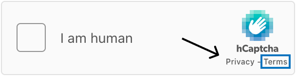
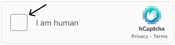
Palette.text comprend .heading, l'en-tête des fenêtres modales du menu, et .body, le texte « Je suis humain » à côté de la case à cocher du widget.
Composant
Les valeurs de la case à cocher permettent de styliser le widget de case à cocher.
-
.main.fillest la couleur de fond, et.main.borderest la couleur de bordure du widget hCaptcha. -
.hover.fillest la couleur de fond du widget hCaptcha lors du survol.
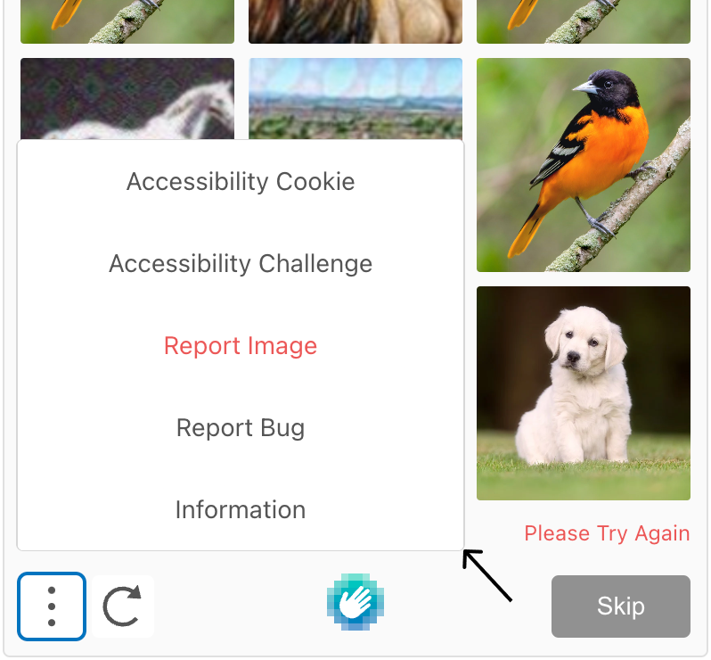
Les valeurs modales permettent de styliser les fenêtres modales lors du clic sur un élément de liste dans le menu du défi (points de suspension verticaux).
-
.main.fillest la couleur de fond de la fenêtre modale. -
.hover.fillest la couleur de fond de la fenêtre modale au survol de la souris. -
.focus.outlinecorrespond à la couleur du contour de la fenêtre modale lorsqu'elle est sélectionnée.
Les valeurs du défi définissent le style de la fenêtre contextuelle de défi que les utilisateurs doivent résoudre pour compléter le hCaptcha.
-
.main.fillest la couleur de fond, et.main.borderest la couleur de bordure du défi. -
.hover.fillest la couleur de fond du défi au survol de la souris.
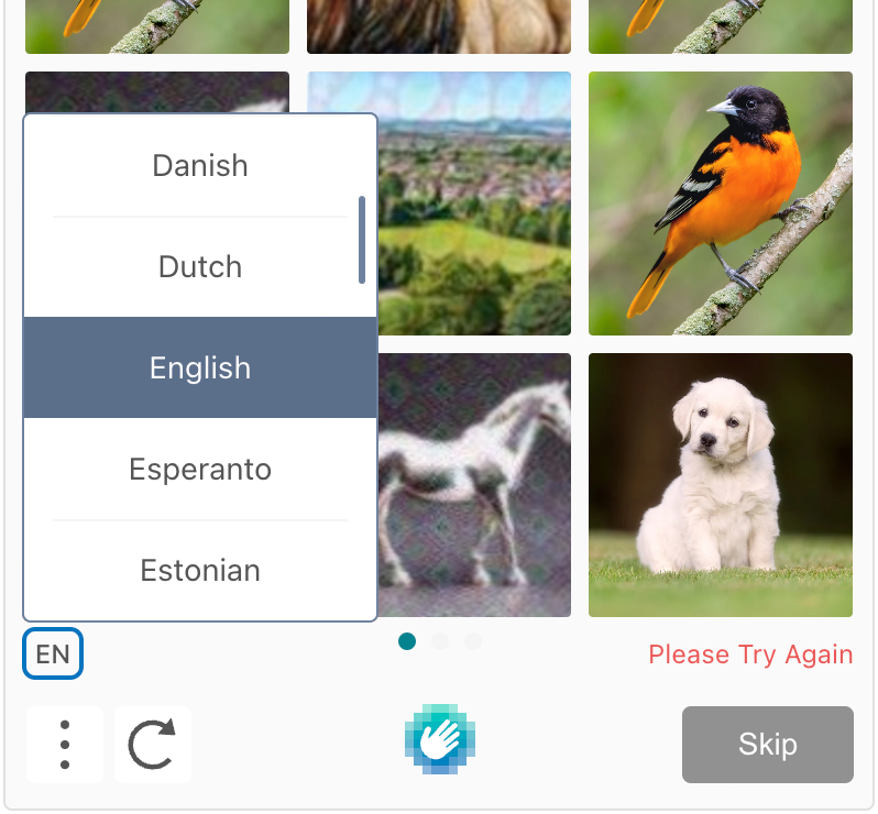
Les valeurs du fil d'Ariane habillent les points de suspension horizontaux sous les images du défi.
-
.main.fillsont les points inactifs affichés. -
.main.activeest le point actif affiché.
Les valeurs des boutons permettent de styliser les icônes des boutons d'interface situés en bas à gauche du défi.
-
.main.fillest la couleur de fond du bouton,.main.iconest la couleur de l'icône et.main.textest la couleur du texte abrégé de la langue. -
.hover.fillcorrespond à la couleur de fond du bouton lorsqu'il est survolé. -
.focus.iconest la couleur de l'icône au survol,.focus.textn'est pas actif etfocus.outlineest la couleur du contour du bouton lorsqu'il est sélectionné. -
Les propriétés
.activene sont pas actives.
La valeur link.focus.outline correspond à la couleur du contour des liens « Confidentialité » et « Conditions d’utilisation » lorsqu’ils sont sélectionnés.
Les valeurs de liste permettent de styliser les fenêtres modales avec des éléments de liste qui s'ouvrent lorsqu'on clique sur les boutons d'icône en bas à gauche du défi.
.main.fillest la couleur d'arrière-plan (derrière ListItem), et.main.borderest la couleur de bordure de la fenêtre modale.
Les valeurs listItem permettent de styliser les lignes cliquables dans les fenêtres modales de la liste des langues et du menu.
-
.main.fillest la couleur de fond,main.lineest la ligne horizontale séparant les lignes etmain.textest la couleur du texte d'un ListItem. -
.hover.fillest la couleur d'arrière-plan de l'élément de liste lors du survol. -
.selected.fillest la couleur d'arrière-plan de l'élément de liste sélectionné dans la liste. -
.focus.outlinen'est pas actif.
Les valeurs d'entrée stylisent la case à cocher cliquable dans le widget qui affiche la coche une fois le hCaptcha complété.
-
.main.fillest la couleur de fond, etmain.borderest la couleur de bordure de la case à cocher carrée. -
focus.bordercorrespond à la couleur de la bordure au survol de la souris etfocus.outlineà la couleur du contour lorsque l'élément est sélectionné..focus.filln'est pas actif.
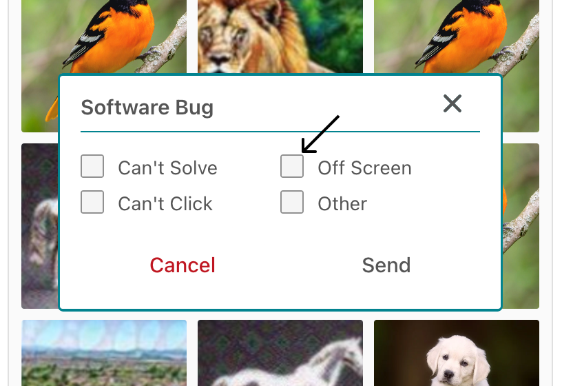
Les valeurs radio permettent de styliser les cases à cocher lors du signalement d'un problème dans le menu modal.
-
.main.fillcorrespond à la couleur de fond de la case à cocher etmain.borderà la couleur de sa bordure.main.checkn'est pas actif. -
.selected.checkest la zone colorée à l'intérieur de la case à cocher indiquant l'élément sélectionné. -
.focus.outlinecorrespond à la couleur du contour de la case à cocher lorsqu'elle est sélectionnée.
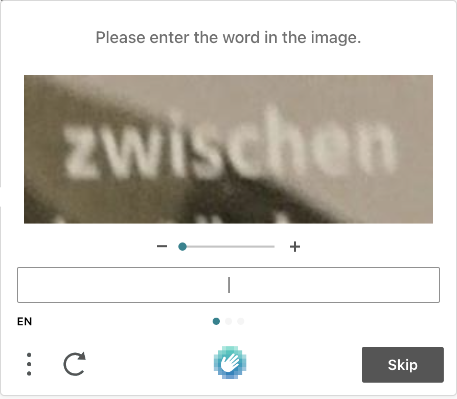
La tâche définit le style des images et du badge utilisés dans le défi hCaptcha.
-
.main.fillest la couleur de fond de l'image du défi. -
.selected.badgeest la couleur du cercle de la coche, et.selected.outlineest la couleur du contour indiquant une image sélectionnée dans le défi. -
.report.badgeest la couleur du cercle de la coche et.selected.outlineest la couleur du contour lors de la sélection d'une image à signaler dans le cadre du défi. -
.focus.badgeet.focus.outlinene sont pas actifs.
Les valeurs prompt mettent en forme la zone d'en-tête qui fournit les instructions pour le défi.
-
.main.fillest la couleur de fond,.main.borderest la couleur de la bordure etmain.textest la couleur du texte de la zone d'en-tête du défi. -
Les propriétés
.reportne sont pas actives.
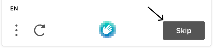
Les valeurs skipButton permettent de styliser le bouton « Passer » situé en bas à droite du défi.
-
.main.fillest la couleur de fond,main.borderest la couleur de la bordure etmain.textest la couleur du texte du bouton Passer. -
.hover.fillest la couleur de fond,hover.borderest la couleur de la bordure ethover.textest la couleur du texte du bouton Ignorer au survol. -
.focus.outlineest la couleur du contour du bouton Passer lorsqu'il est sélectionné.
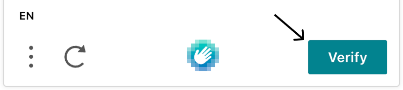
Les valeurs de verifyButton permettent de styliser le bouton « Vérifier » situé en bas à droite du défi.
-
.main.fillest la couleur de fond,main.borderest la couleur de la bordure etmain.textest la couleur du texte du bouton Vérifier. -
.hover.fillest la couleur de fond,hover.borderest la couleur de la bordure ethover.textest la couleur du texte du bouton Vérifier au survol. -
.focus.outlinecorrespond à la couleur du contour du bouton Vérifier lorsqu'il est sélectionné.
Les valeurs du curseur permettent de styliser le curseur utilisé dans les défis de saisie libre.
-
.main.barest la couleur de la barre du curseur et.main.handleest la couleur du contrôleur du curseur. -
.focus.handlecorrespond à la couleur du contrôleur du curseur lorsqu'il est sélectionné.
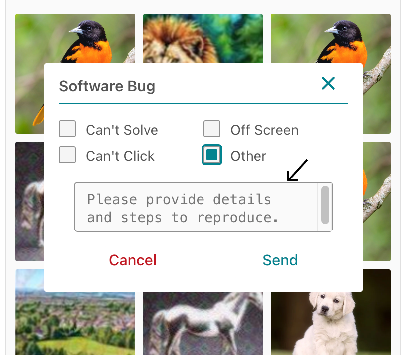
Les valeurs textarea permettent de styliser la zone de texte lors du signalement d'un bug et la zone de texte du défi de saisie libre de texte.
.main.fillest la couleur de fond, et.main.borderest la couleur de bordure de la zone de texte « Autre » lors du signalement d'un bug.
-
.focus.fillest la couleur de fond de la zone de texte et.focus.outlineest la couleur du contour dans le défi de saisie libre de texte lorsqu'il est sélectionné. -
.disabled.fillest la couleur d'arrière-plan de la zone de texte dans le défi de saisie libre de texte lorsqu'il est désactivé.
Essayez-le en direct
Tester des thèmes personnalisés sur un widget hCaptcha en direct :
Exemples
Exemple utilisant uniquement la personnalisation de la palette :
var vibrantTheme = {
  palette: {
    mode: "light",
    grey: { 100: "#FAFAFA", 200: "#F5F5F5", 300: "#E0E0E0", 400: "#D7D7D7", 500: "#BFBFBF", 600: "#919191", 700: "#555555", 800: "#333333", 900: "#222222", 1000: "#14191F" },
    primary: { main: "#FF5722" },
    warn: { main: "#F44336" },
    text: { heading: "#212121", body: "#212121" }
  },
};
Exemple utilisant à la fois la personnalisation de la palette et des composants :
var subtleDarkTheme = {
  palette: {
    mode: "dark",
    grey: {
      100: "#FAFAFA",
      200: "#F5F5F5",
      300: "#E0E0E0",
      400: "#D7D7D7",
      500: "#BFBFBF",
      600: "#919191",
      700: "#787878",
      800: "#5E5E5E",
      900: "#444444",
      1000: "#2A2A2A"
    },
    primary: {
      main: "#607D8B"
    },
    warn: {
      main: "#FF5722"
    },
    text: {
      heading: "#F5F5F5",
      body: "#E0E0E0"
    }
  },
  component: {
    checkbox: {
      main: {
        fill: "#424242",
        border: "#616161"
      },
    },
    input: {
      main: {
        fill: "#424242",
        border: "#616161"
      },
      focus: {
        fill: "#555555",
        border: "#6A6A6A",
        outline: "#607D8B"
      }
    },
    challenge: {
      main: {
        fill: "#303030",
        border: "#424242"
      },
      hover: {
        fill: "#383838"
      }
    },
    button: {
      main: {
        fill: "#424242",
        icon: "#F5F5F5",
        text: "#F5F5F5"
      },
      hover: {
        fill: "#555555"
      },
      focus: {
        icon: "#607D8B",
        text: "#607D8B",
        outline: "#607D8B"
      },
      active: {
        fill: "#555555",
        icon: "#F5F5F5",
        text: "#F5F5F5"
      }
    },
    modal: {
      main: {
        fill: "#222222"
      },
      hover: {
        fill: "#303030"
      },
      focus: {
        outline: "#607D8B"
      }
    }
  }
};